

Introduction
Instagram has recently launched a much-awaited "visual refresh" as part of its ongoing efforts to modernize its platform. This update includes subtle changes to the logo, typeface, and full-screen marketing layouts, all aimed at enhancing user experience and inclusivity.
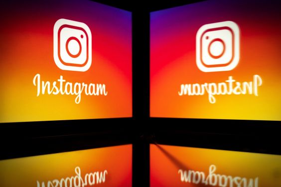
The Logo: A Gradient of Emphasis
The new gradient logo is designed to feel more dynamic and alive. Instagram explained that this change was inspired by the desire to make the platform’s brand more accessible globally. The gradient design also aligns with Instagram’s broader goal of creating a seamless and intuitive user experience, particularly for creators from diverse linguistic backgrounds.
New Typeface: Instagram Sans
The reveal of Instagram Sans has been met with great excitement among users. This new sans-serif typeface is inspired by Instagram’s signature logo, combining elements of squares and circles (referred to as "squircles") with global scripts such as Arabic, Thai, and Japanese. Instagram emphasized that the font was crafted to reflect modern design trends while maintaining cultural sensitivity.
Variations of Instagram Sans
Instagram Sans comes in several weights:
- Regular: A balanced typeface suitable for most text sizes.
- Bold: For stronger emphasis and headings.
- Light: Perfect for subheadings and lighter content.
- Medium: A versatile option for body text.
- Condensed: Ideal for shorter lines of text.
- Condensed Bold: Combines the compactness of condensed typefaces with bold weight.
Applications in Design
Instagram Sans has been incorporated into various design elements, including Reels captions, Instagram Stories tags, and brand guidelines. The font’s versatility allows creators to express themselves authentically across different platforms, ensuring consistency in their online presence.
Full-Screen Marketing Layouts: A Shift Toward Simplicity
The introduction of full-screen marketing layouts represents a significant shift in how content is consumed on Instagram. This new layout aims to prioritize user experience and reduce scroll height, making it easier for creators to showcase their work without distractions.
Test Phase Details
Instagram has been experimenting with this new format during a limited test phase. Users can still switch between accounts or posts using the top navigation bar, while the Reels tab remains accessible on the bottom bar at the end of each post preview. The design also integrates seamlessly into other parts of the app, such as the home feed and stories grid.
Potential Impact
This change is part of Instagram’s ongoing commitment to experimentation in order to test new features before a broader rollout. The company has been cautious with major updates due to the potential feedback they might receive from users.
Conclusion
Instagram’s visual refresh is a strategic move aimed at staying ahead of user expectations and keeping pace with evolving design trends. By introducing these subtle yet impactful changes, the platform continues to solidify its position as a leading social media destination.